Blog 9
In the process of decorating and running this blog I talked to a lot of students, and I summarized some of my feedback about this website.

navigation
- It is not very easy to categorize by project and blog, and many times the posts are not classified.
The boundaries of time and classification are not clear.
content - Not enough freedom to change the style of text and pictures when writing content.
- A lot of HD videos and pictures uploaded on this platform need to be compressed and can not be expressed well.
- The division of modules is also not very clear.
Can find sexual
— The query name is relatively clear - can only query directly, no similar recommendation function.
The user experience
— The overall design guidance is clear, simple and easy to get started. - Relatively limited functional design.
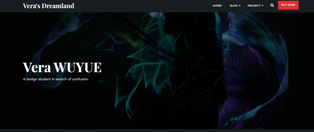
— Dark colors are very personal.
readability
— The picture section is easier to read, and the text always zooms out automatically.
0